less is more
My favorite kind of logos to design are the ones that aren’t obvious at first sight. Ones that are minimal but strong. Here are my favorite logos and the thoughts behind them.
“B” exclusives
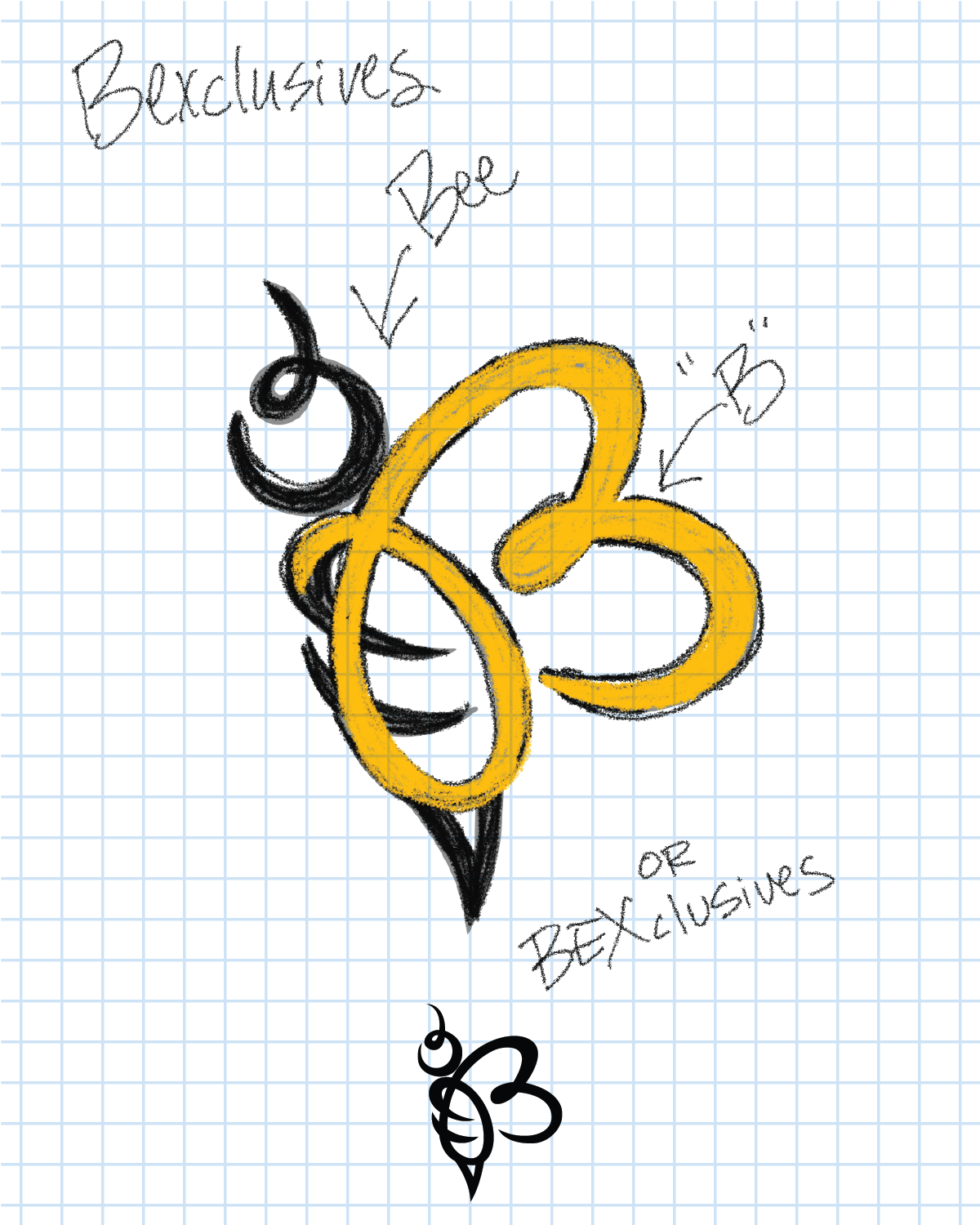
I designed this logo in 2015 during a rebrand of the original “Bee” logo. My company name is “Bexclusives”, my name is Becky but Im known as “Bex” so the “B” represents my name and company name.
I found a way to make the body of the bee into the “B”. There is also a hidden heart in there as well.
The deeper meaning for me is the significance behind the “bee” itself, “symbol of hard work and perseverance in the face of adversity” which I heavily relate to.
Collin “young bull” sexton
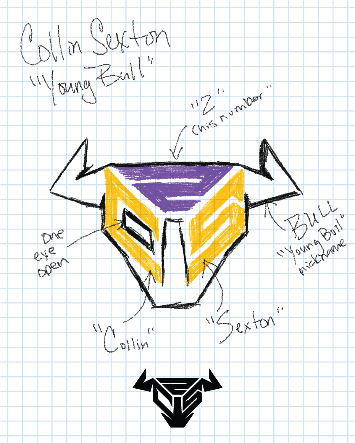
This might be my most successfully executed logos of my career. Although his number has changed since signing to the Lakers, the “C” and “S” is the integral part of this logo and how it shaped the bull.
I love how strong the logo is while also being simplistic.
3d|vzxn
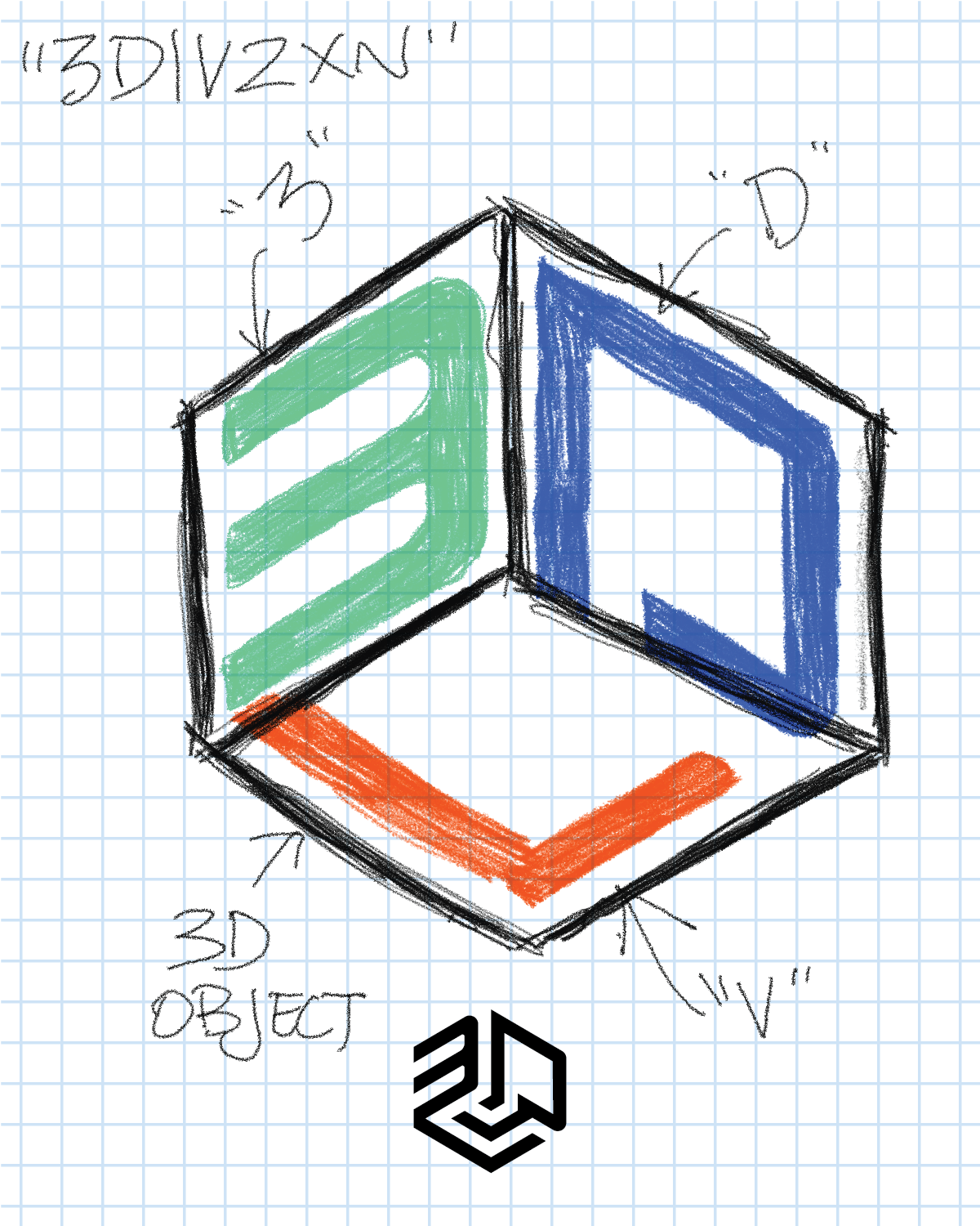
My goal for this logo was to capture the “3D” affect using lines. The client is a fan of simplicity so I wanted to deliver on that goal.
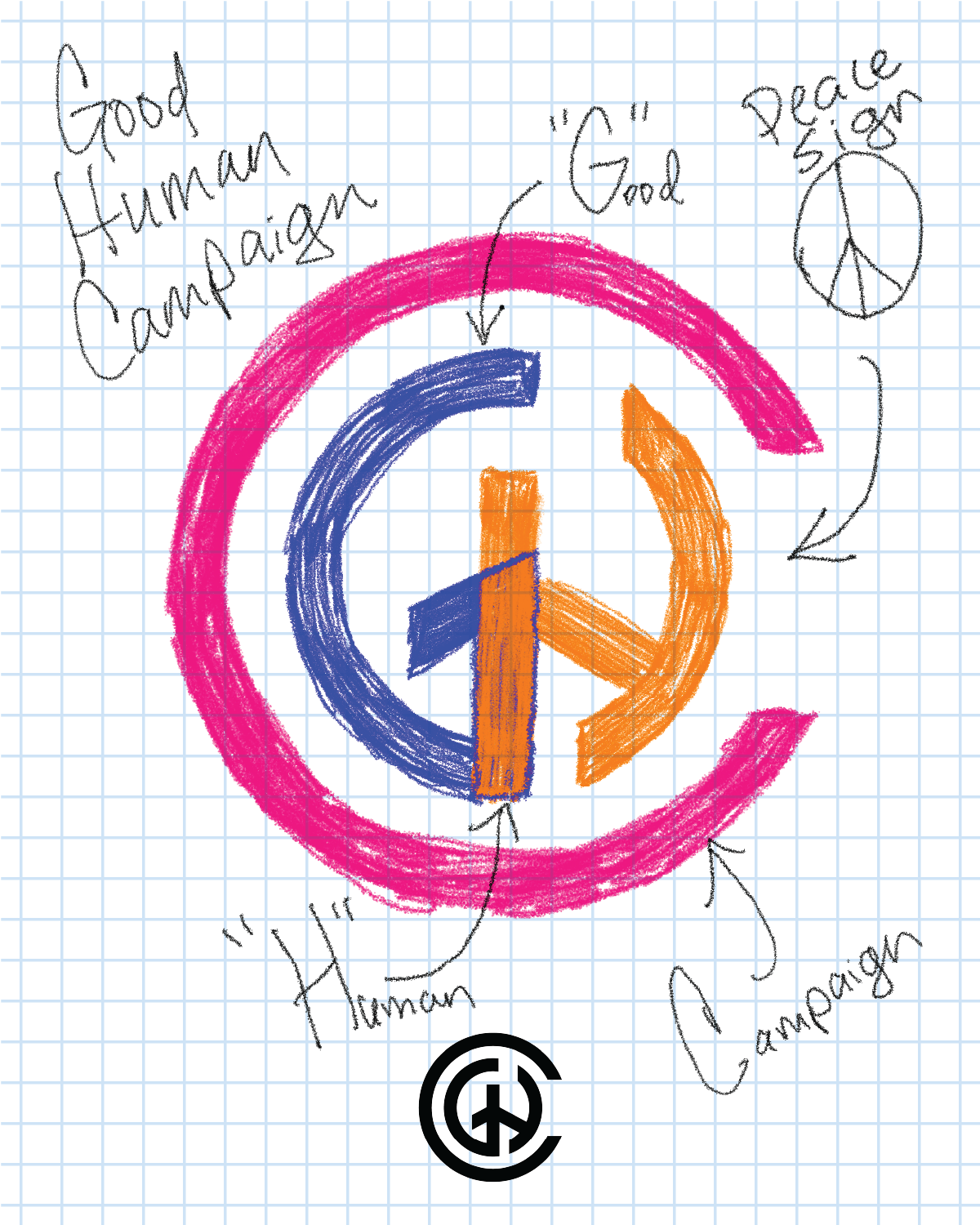
good human campaign
The goal for this logo was to capture the “G-H-C” in a simple and “icon” kind of way. A logo that can be used on anything and everywhere. When I looked at the “peace sign” I saw the letters and created this logo.
It fits the brand perfectly.
skill wing
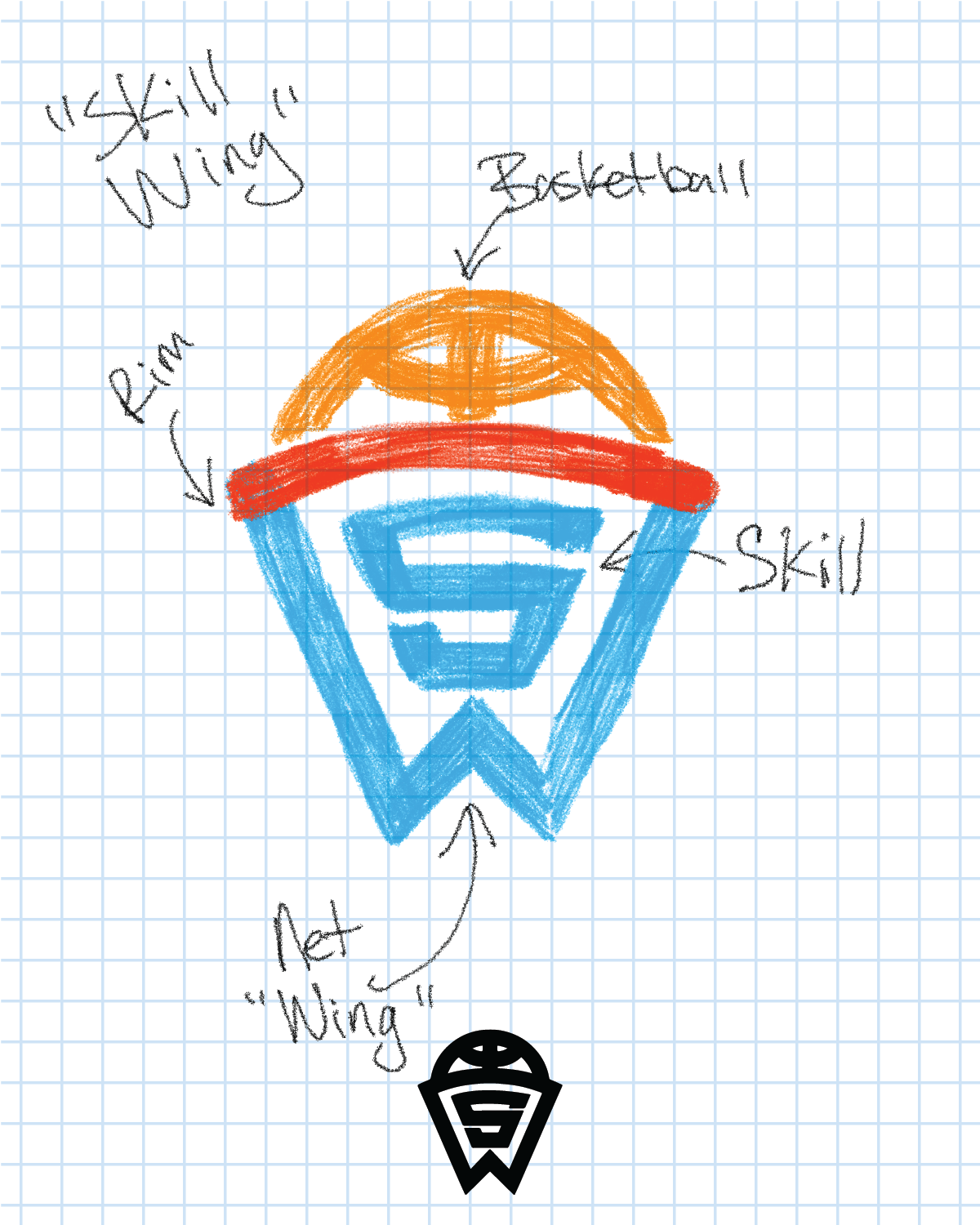
The client worked in the basketball industry. My goal with this logo was to capture the “S” and the “W” and including the basketball theme. The logo needed to work on uniforms as well as all other brand merchandise and materials.